


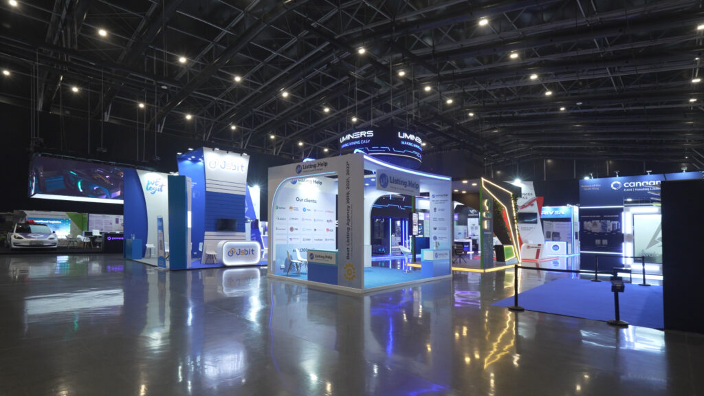
At most expos, stands quickly blend. The ones people remember feel like a true reflection of the brand — not just a structure with a logo.
A stand has only moments to grab attention and tell your story. Engaging multimedia expo stands can help showcase your brand, giving visitors a clear sense of who you are before the first word is spoken.
Begin with a clear brand story
Good exhibition design starts long before anyone opens 3D software or talks about materials. Condense your brand story into a single page and focus on what matters most for the event.
Ask a few direct questions:
- Who is your target — prospects, clients, partners, or distributors?
- What key problem will you address clearly?
- What feeling should people leave with after a five‑minute chat — trust, excitement, reassurance, curiosity?
Once this is clear, choices about colours, fonts, and imagery become easier. Your main headline, hero visual, and logo should all point in the same direction. If you covered the logo, someone familiar with your brand should still say “this looks like them” just from the mood and style of the space. The design of exhibition stands that truly work always starts from this brand clarity, not from decoration alone.
Design of Exhibition Stands: Layout and Flow Tips
Visitors move through the stand in stages: approach, enter, and decide to stay. A simple, open layout often performs better than a complicated design that looks great only from one camera angle.
Think about:
- A wide, barrier‑free entrance so people can step in without feeling awkward.
- A natural route from the front edge to your main message, then to products or demos.
- One or two semi‑private spots where serious discussions can happen without blocking the aisle.
Avoid building a tall wall or counter right at the boundary unless privacy is your main goal. People hesitate to cross a hard line but happily wander into spaces that feel open and friendly. Think of layout as real-world UX: guide visitors and make the next step clear.
Use visuals that carry your message
Strong visuals don’t mean “more graphics everywhere.” They mean the right few elements, arranged so the message is impossible to miss. A clear headline, a short line, and focused visuals beat a cluttered backdrop.
Useful tips:
- Use your brand colours and add only one accent if needed.
- Limit yourself to one heading font and one body font, used consistently.
- Make sure key lines are readable from the aisle; long explanations belong in brochures, QR‑linked pages, or one‑to‑one conversations.
Lighting deserves its own thought. Directional lighting can highlight hero products or demo zones, while softer, warmer light makes meeting areas feel comfortable. If your brand positions itself as high‑tech and bold, cooler tones and backlit details may fit. For premium, calm brands, warmer tones and natural textures usually feel more honest.
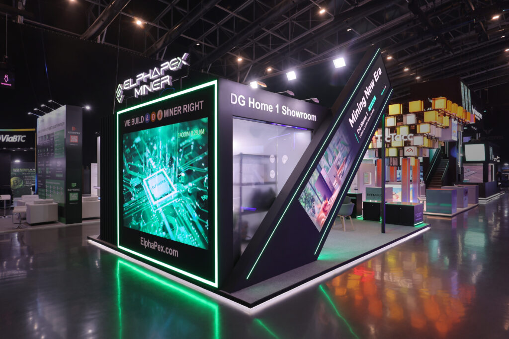
Add multimedia where it genuinely helps
Screens and interactive tools can lift a stand, but only when they are tied to a clear purpose. A long, silent corporate video looping all day is usually not worth the screen time. Short, focused content works better in a noisy hall where attention is scarce.
Ideas that typically work well:
- Short video loops on LED screens that show a product in use, a key benefit, or a quick before‑and‑after.
- Touchscreens where visitors can pick what they want to learn — case studies, technical specs, or pricing ranges.
- Simple interactive ideas like a quiz, spin wheel, or small challenge linked to your product story, with a small takeaway or digital reward.
Think beyond visuals. Hands-on samples or live demos create stronger memories; anything that does not spark conversation is just filler.
Get the practical details right
Visitors may not notice good planning, but they notice its absence. If your stand looks messy by midday, people notice — and it makes your brand look careless.
Plan for:
- Hidden storage for bags, giveaways, and personal items keeps the space clear.
- Power and data points exactly where you need them for screens, laptops, and demos, not as an afterthought.
- Small comfort details such as a water station, a place to sit for a quick talk, or even a discreet phone‑charging point if space allows.
These details quietly show that you’re reliable and care. A tidy, comfortable stand reflects a well-organised brand. A beautiful structure with cables everywhere and boxes in corners tells the opposite story.
Plan for Reuse and Longevity
For multiple shows, make your stand modular and reusable for easy adjustments.
Think beyond one show
When you sit down with your stand designer, talk about your full exhibition calendar, not just the next event on the list. Share the usual stand sizes you book — maybe a 3×3 space at one show and a larger footprint at a flagship expo — so the framework can be scaled and reconfigured instead of thrown away and rebuilt every time.
Choose modular, hard‑wearing structures
Ask specifically for modular systems and sturdy materials that are meant for repeated builds. Aluminium profiles, fabric graphics, and click‑together panels are popular because they can be assembled, taken down, transported, and stored many times without looking tired if they are handled properly. Over a couple of seasons, this usually works out cheaper than commissioning a completely new custom build for each show.
Separate long‑life and short‑life graphics
Not every message on your stand changes every time. Keep your core brand story, logo, and key visuals on panels you plan to reuse for several events. Then put dates, offers, and specific product launches onto smaller, cheaper graphic pieces that can be swapped out as needed. That way, you refresh only what has actually changed instead of reprinting everything.
Sort out storage and upkeep early
Before the first show ends, plan the next location, packing, storage, and maintenance. Agree with your supplier on labelling, checks, and refreshing worn parts to keep the stand looking good for every event. This way, you waste less, get more value from the same stand, and keep your brand looking consistent, which is why many choose modular, reusable stands.
Work with the right exhibition stand designer in Dubai
If you exhibit in Dubai or the wider UAE, local knowledge can save a lot of stress. There are specific venue rules, tight build schedules, and very different audience profiles between shows, from industry‑only events to public expos. An experienced exhibition stand designer Dubai already understands these constraints and knows what will actually pass approvals and be practical on site.
When you brief a stand designer:
- Share your annual exhibition plan, not just one event, so they can suggest structures that can adapt and re‑use elements.
- Explain your main audience and what counts as “success” at each show — qualified leads, demo numbers, sign‑ups, or direct orders.
- Be honest about budget and timelines so design decisions match reality from the start.
A good partner blends creativity, engineering, and project management. They turn your brand story into a stand that can be built safely, transported efficiently, and installed on time, without losing the character that makes it feel like you. Over a full season, that mix of smart design and reliability often matters more than any single visual trick.
Start planning your next Dubai exhibition today with Insight Exp — capture leads and make your brand unforgettable.
Learn more:
Blockchain Life 2023 in Dubai has become a premier event for blockchain enthusiasts and industry le...
Explore 2026 exhibition stand design trends in the UAE, featuring innovation, sustainability, and e...
